Uber Freight Concept
UI/UX - Freight Solution - Mobile
As part of a pitch meeting with Uber, we wanted to bring them a new version of their Uber Frieght app. We created a fresh UI, overhauled with a completely new user experience.
Simplify everything.
Maintaining Excitement.
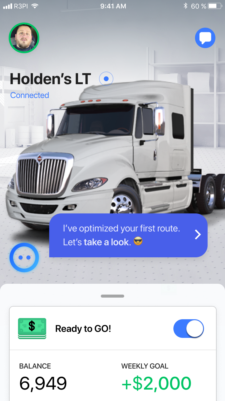
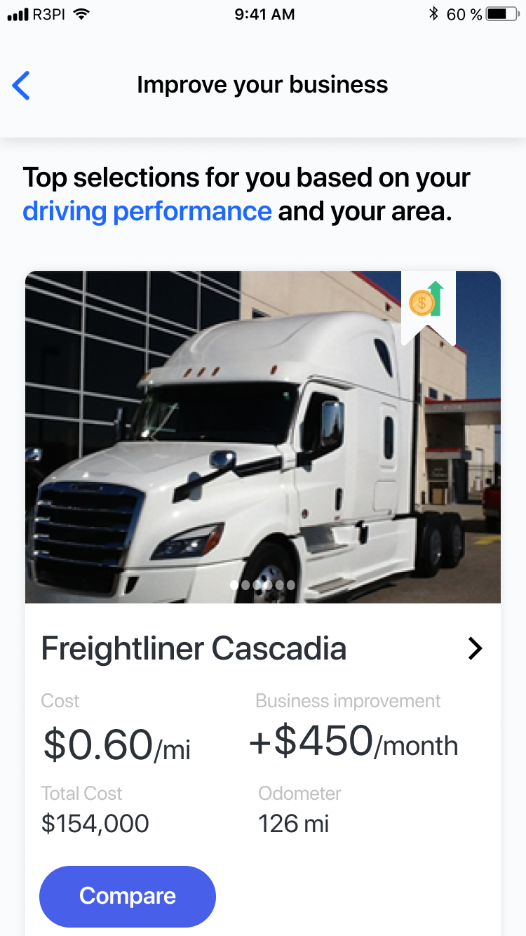
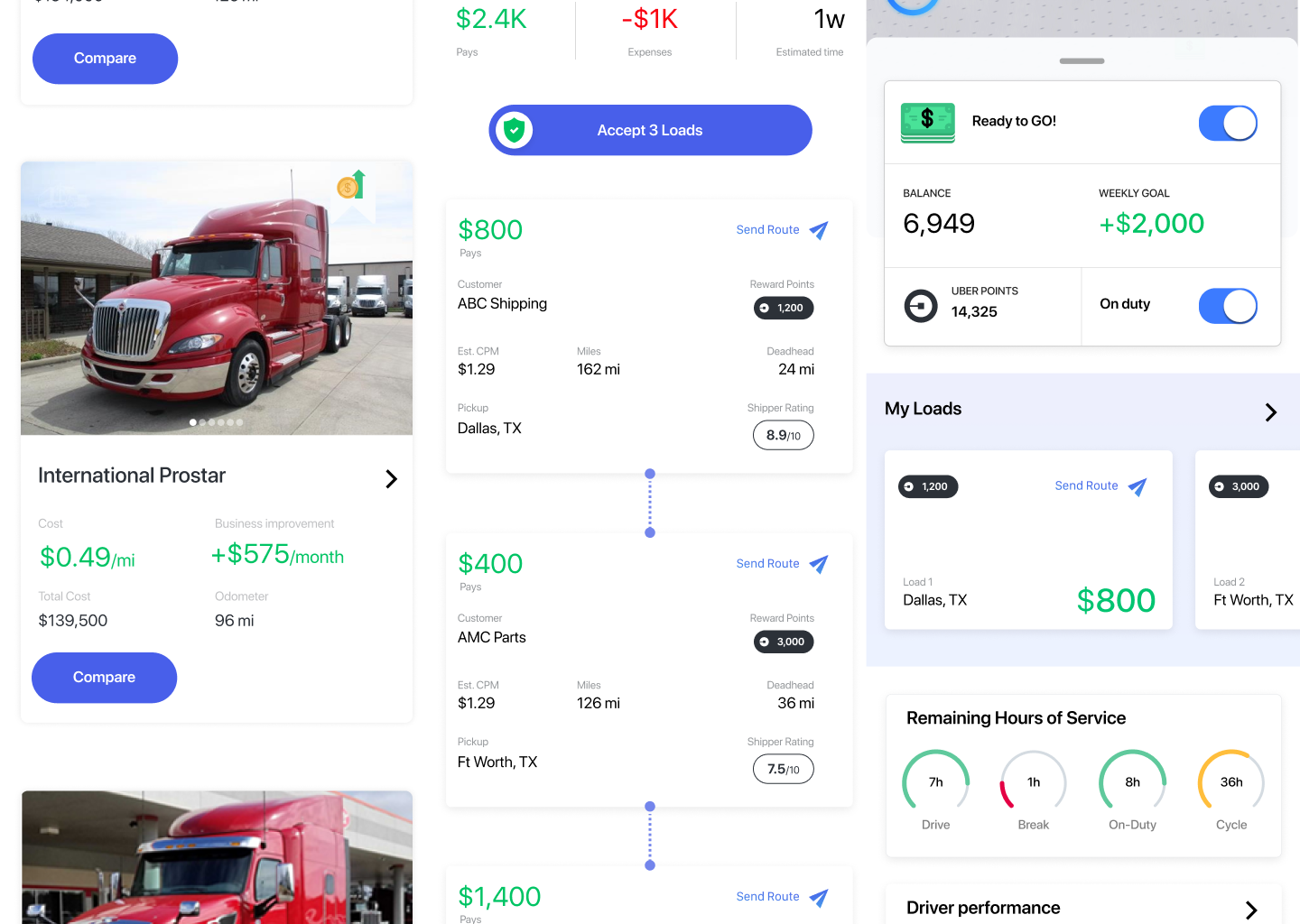
Our primary mission with this design was simplicity. We wanted the user to have full control over how they make money, in addition to being able to see how they rank and how their vehicle is performing. But we didn't want to simply display this, we wanted to make it as easy and straightforward to digest as possible.
Functionally invaluable.
The Challenge.
For freight drivers, their cargo and truck is their life. It's their livelihood. If we were going to create an app that these drivers would want to use on a daily basis, we'd need to pack it full of features that wouldn't merely make it 'useful.' We'd need to give drivers features that would make this app invaluable to them.
Financial visibility.
A big focus we had for this was the financial side of things. We wanted drivers to see how much they were making, how much they could be making, and how much they have made.
Since their vehicle directly influences how much money they make, we pulled in financial information from their vehicle as well. Using complex analytics we integrated methods for the driver to see when it was financially sensible to upgrade their rig for more profit.

Unrivaled security.
The Challenge.
This new UX would leverage one of Solera's most important companies, Digidentity. Using Digidentity, we would be able to keep a user's personal and financial information completely secure and encrypted. Utilizing facial verification, we would also be able to make sure that the only person accessing a driver's information would be that driver.
Daily gamechanger.
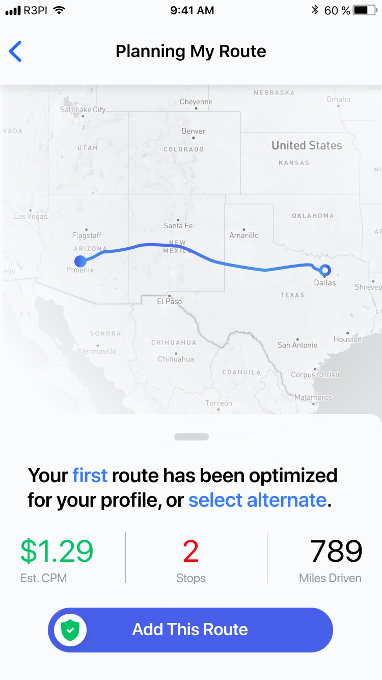
After researching truck drivers for this project, we began discovering just how important a simple app could be for their careers. A simple way to quickly book and look up information on shipments is something that streamlines everything in their day-to-day. This allows them to spend less time sifting through jobs and more time earning money to support themselves and their families.